A chart can look convincing even when an AI explanation gets its axes wrong. Reliable PDF chart analysis combines visual inspection, focused questions, and source checks, so you can understand figures without accepting unsupported claims.
AI can help you identify trends and locate explanations, but important findings still need verification in the original paper. Start by giving the tool a readable figure and enough context to interpret it.
Key Takeaways
Use a tool that can inspect figure images, not only extract PDF text.
Ask AI to identify titles, axes, units, legends, scales, and uncertainty before interpreting results.
Separate visible patterns from the authors' conclusions, then verify both against captions, methods, and surrounding text.
Keep the original PDF open throughout your analysis. A fluent answer, even with a page citation, can misidentify a curve or overstate what the study establishes.
Start PDF Chart Analysis With a Readable Source
Check whether the tool can see the figure
Try selecting a sentence in the PDF. Selectable text suggests a usable text layer, although it doesn't guarantee that charts reach the AI.
A document-chat system may retrieve captions while missing the plotted image. Check whether your chosen tool supports visual analysis of PDF pages or uploaded figure crops.
For scanned papers, OCR helps recover captions and labels. OCRmyPDF and AWS Textract are options for text recognition, but OCR alone doesn't interpret curves or reconstruct underlying chart data. Test one difficult page before processing the whole paper.
Preserve the figure's context
Use the highest-quality original available. Export or crop the figure without cutting off its title, axis labels, legend, panel identifiers, or caption.
Keep the source filename, figure number, and page reference beside the image. Record both the PDF page index and printed page number when they differ.
Also provide the relevant results and methods passages. The surrounding text supplies context and technical information about the population, measurement, and analysis.
NotebookLama's document assistant supports source-referenced PDF conversations. Use document chat to find that context, then verify whether the tool can inspect the figure itself.
Read the Chart's Visual Grammar Before Its Message
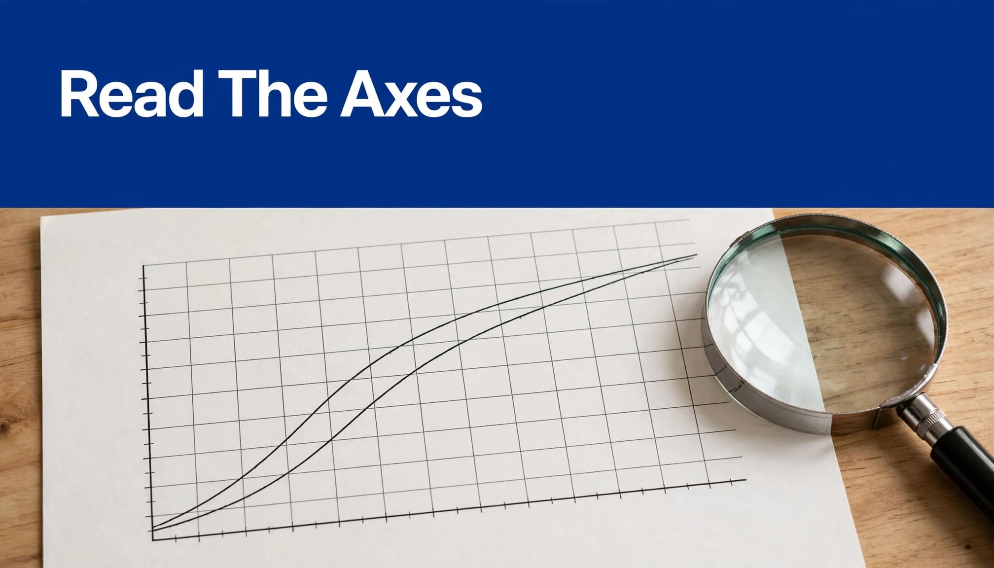
Identify titles, axes, units, and legends
Ask AI to transcribe the figure title and describe what each axis measures. Then request units, category labels, time intervals, and the meaning of each series.
Don't let it infer missing units. A percentage, proportion, count, and rate describe different quantities.
For legends, verify both colors and line styles. Low-resolution images can make blue and purple curves indistinguishable. Dashed lines, marker shapes, and nearby labels may provide stronger identification cues.
For multi-panel figures, inspect each panel separately. Similar-looking panels may use different populations or axis ranges. The UNC Writing Center's guide to figures and charts offers useful background on clear visual presentation.
Check scales, baselines, and transformations
Request the axis minimum, maximum, tick spacing, and scale type. Check for truncated baselines, broken axes, reversed directions, and normalized values.
On a logarithmic axis, equal spacing indicates equal ratios. For example, 1, 10, and 100 can occupy equally spaced positions on a base-10 scale.
AI can mistake that spacing for equal numerical increments. Consequently, its description of growth or group differences may be wrong.
Also distinguish raw measurements from standardized scores, indexed values, and model predictions. A rising line doesn't tell you which transformation produced it.
Ask AI Questions You Can Check
Begin with description, not conclusions
A broad request such as "Explain this paper" often skips the details that determine a chart's meaning. Start with a bounded inspection prompt:
"Inspect the selected figure. Identify its title, panels, axes, units, legend, scale types, and uncertainty markers. Mark unreadable details as UNREADABLE. Separate visible information from information supplied by the caption."
Review the answer before asking about results. If the model misidentifies the axis or legend, correct that error first.
Then ask about direction, turning points, outliers, plateaus, and differences between groups. Request the panel and series supporting each observation. This makes an answer easier to audit than a general summary.
Request comparisons with explicit limits
Tell the model what to compare and which evidence it may use:
"Compare the groups in this figure using its caption and results paragraph. Describe the main visible differences. Distinguish visual estimates from reported values. Cite the relevant pages and identify conclusions the figure alone cannot support."
Watch for comparisons across incompatible scales or measurement definitions. Two curves can look equally steep while showing different numerical changes.
For cross-paper PDF chart analysis, check population, outcome definition, units, and follow-up period before comparing patterns. Also inspect sample sizes and adjustments. Otherwise, a tidy comparison may hide methodological differences that matter more than the visual resemblance.
Interpret Uncertainty Without Inventing Certainty
Establish what error bars and bands mean
Ask whether the figure shows standard deviations, standard errors, confidence intervals, credible intervals, or another quantity. The caption or methods should define them.
If neither does, record the meaning as unknown. Don't let AI label every shaded region a 95% confidence interval.
Next, check sample size, missing observations, and whether points represent individual measurements or averages. These details affect interpretation.
Overlapping error bars don't automatically settle statistical significance. Likewise, apparently separated curves don't replace the paper's reported statistical test. Ask AI to locate the test, effect estimate, and uncertainty interval rather than judge significance by appearance.
Separate association from causal evidence
A scatterplot can show an association. A time-series chart can show that two quantities changed together. Neither establishes causation by itself.
The Australian Bureau of Statistics explains this distinction in its guidance on correlation and causation.
Ask AI to identify the study design and the authors' causal claims. Then check randomization, confounding, selection effects, and the assumptions behind any causal analysis.
For model diagrams or protocol figures, arrows describe proposed relationships or process steps. They don't independently prove those relationships. The methods, evidence, or formal verification must support the claim.
Verify Interpretations Against the Whole Paper
A citation pointing to the correct page is a starting point. It doesn't prove that the cited material supports the answer.
Check captions and methods together
Read the full caption, including footnotes and definitions. Rice University's guidance on technical figures emphasizes the role of captions in interpreting figures.
Then check methods for exclusions, preprocessing, normalization, smoothing, and statistical procedures. A smooth line might be a fitted model rather than observed measurements.
A useful follow-up prompt is: "Which caption details or methodological choices limit this interpretation? Cite the supporting passages and identify anything the paper leaves undefined."
Open each cited passage. Confirm that the AI hasn't attached a nearby but unrelated methods statement to the figure.
Compare the answer with surrounding text
Find the paragraph that discusses the figure. Compare the AI's wording with the authors' wording, especially qualifiers such as "associated," "estimated," or "under these conditions."
Also inspect limitations and supplementary material. The main figure may omit sensitivity analyses or subgroup results.
Keep three categories in your research notes: what the source reports, your interpretation, and an unverified AI suggestion. This prevents a tentative explanation from becoming a cited finding.
Before submitting academic work, verify figure numbers, quotations, page references, and conclusions against the original publication. Cite the paper, not the chatbot's explanation.
Get Exact Values From Data, Not Visual Guesses
AI can describe a visible trend without knowing its exact underlying values. For calculations, first look for a source table, supplementary spreadsheet, or linked data repository.
If the values appear in a digital PDF table, tools such as Camelot or pdfplumber can help extract them. Scanned tables may need OCR-backed processing.
Preserve multi-level headers, units, blank cells, footnotes, and page numbers. Then compare the extraction with the page image, especially decimals, negative signs, and shifted columns.
A focused cleanup prompt is: "Export this extracted table as CSV. Preserve blank cells and units. Mark uncertain cells REVIEW instead of guessing."
When only the chart exists, chart digitization produces estimates, not original measurements. Label those estimates and document the extraction method. For publication-quality quantitative analysis, prefer the underlying data whenever available.
Manual review may be faster for one small, high-stakes figure than correcting a plausible but inaccurate automated extraction.
Protect Documents and Keep an Audit Trail
Before uploading a PDF, check confidentiality, participant privacy, copyright, and applicable institutional record keeping requirements or regulatory compliance rules. Permission to read a paper doesn't automatically permit every form of third-party processing or redistribution.
Review the service's retention, model-training, deletion, storage, and access policies. Avoid uploading identifiable participant information, embargoed findings, restricted manuscripts, or proprietary data without authorization.
An approved private environment or local processing may be preferable. However, figure crops, OCR output, and exported spreadsheets also need protection. NotebookLama's guidance on private research document safeguards covers these decisions.
Also follow your institution's disclosure requirements and relevant publisher policies, including Wiley's AI research guidelines.
Save the original PDF, prompts, AI responses, corrected interpretations, and verified references. This record helps you revisit disputed findings and explain how you reached your conclusions. Keep corrections beside the original response so you don't accidentally reuse an earlier mistake.
Frequently Asked Questions
Can AI accurately read charts in a PDF?
AI can identify chart elements and describe visible patterns when the tool can inspect the figure image. Verify its reading of axes, units, legends, and scales against the original PDF because image quality and layout can cause mistakes.
How should I verify an AI interpretation of a chart?
Check the full caption, methods, and surrounding results text, then open the passages cited by the tool. Keep the authors' reported findings separate from your own interpretation and any unverified AI suggestions.
Can AI extract exact values from a chart?
AI may estimate values from a plotted image, but those estimates are not the original measurements. Look for a source table or linked dataset for exact values, and label digitized chart values as estimates.
Can a chart prove that one factor caused another?
A chart may show an association or a change over time, but that alone does not establish causation. Check the study design, methods, and authors' stated limitations before drawing a causal conclusion.
Make the Original Figure Your Final Authority
Good PDF chart analysis uses AI to organize inspection, locate context, and test interpretations. Source verification keeps those explanations tied to the evidence.
Read the axes before accepting the trend, and read the methods before accepting the conclusion. When an important detail remains unreadable or unsupported, leave it unresolved rather than turning a confident AI answer into a research finding.